U Chart Guide: Monitoring Defects per Unit for Quality Control
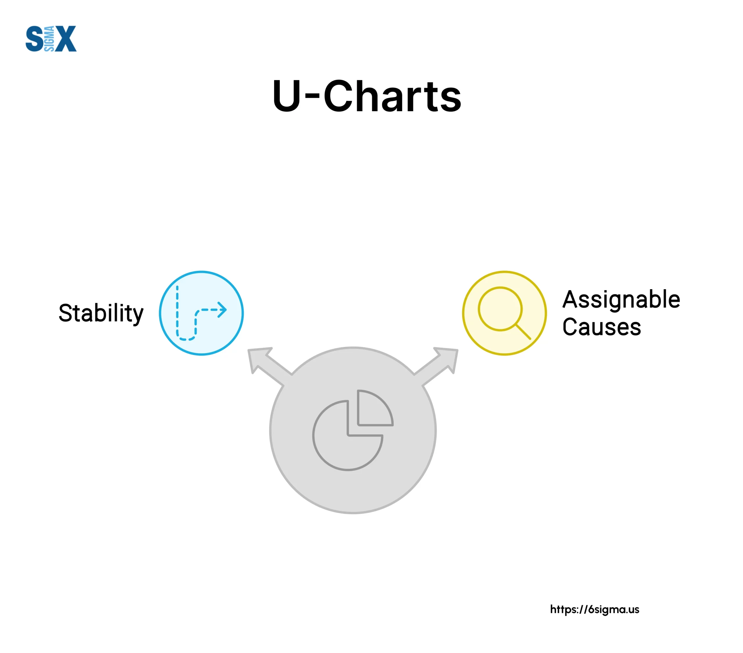
Quality charts prove invaluable aids. Among options, U-charts stand as a treasure controlling non-compliances observed per item when dealing with varying batch sizes.
Dubbed the “defects-per-unit control graph“, the U-chart helps quality experts track typical non-compliance amounts discovered per unit or area inspected.
Unlike counterparts simply noting complete non-compliance counts, it scales findings by batch scope – especially handy with fluctuating sizes.
By leveraging Poisson distribution principles, U-charts offer sound statistical methods for spotting shifts or variations signaling special factors as causation.
Having this visibility proves invaluable in maintaining a steady workflow, finding enhancement options, and ultimately boosting product or service standards overall.
For quality teams continuously optimizing operations through evidence, U-charts shine as accomplices worth familiarizing.
Their scaled per-unit observations and rigorous variation alerts inspire both troubleshooting and future-proofing strategies when variability surfaces in production flows.
Key Highlights
- Understand the fundamentals of attribute control charts and their application in quality control
- Learn when to use a U chart over other attribute charts, such as the P, NP, or C charts
- Explore the underlying assumptions and requirements for constructing accurate U-charts
- Step-by-step guidance on data collection, calculation of control limits, and charting techniques
- Gain insights into interpreting U charts, identifying out-of-control processes, and root cause analysis
- Appreciate the benefits of U charts in Six Sigma and overall process improvement initiatives
Understanding Attribute Control Charts
Before delving into the intricacies of the U-chart, it’s essential to understand the broader context of attribute control charts and their role in quality control.
In statistical process control, data can be classified into two main categories: variables data and attributes data.
Variables data involves measurements on a continuous scale, such as length, weight, or temperature.
Attribute data, on the other hand, deals with binary or counting characteristics, where an item or unit is either conforming or nonconforming, or the number of defects or nonconformities is counted.
Counting type attributes data focuses on quantifying the number of defects or nonconformities present in a product, process, or service.
Unlike pass/fail data, where an item is simply classified as defective or not, counting data provides more granular information by tallying the specific number of defects or nonconformities observed.
Examples of counting type attributes data include the number of surface blemishes on a plastic sheet, the number of customer complaints received, or the number of infections in a healthcare facility.
By counting defects per unit or inspection area, we gain valuable insights into the process’s performance and can identify areas for improvement.
Types of Charts
Attribute control charts are designed to monitor and analyze attribute data. The four main types of attribute charts are:
- P-chart: Used to monitor the proportion of nonconforming units in a sample or subgroup.
- NP-chart: Similar to the P-chart but used when the subgroup size is constant and the number of nonconforming units is relatively small.
- C-chart: Tracks the total number of nonconformities or defects in a sample or subgroup, assuming a constant subgroup size.
- U-chart: Monitors the average number of nonconformities or defects per unit when dealing with varying sample sizes or inspection areas.
The choice of chart depends on the nature of the data, the subgroup size, and the specific quality characteristic being monitored.
When to Use a U-Chart
The U chart, also known as the “control chart for defects per unit”, is particularly useful in scenarios where the subgroup size, or the area of opportunity for defects to occur, varies from subgroup to subgroup.
This contrasts with the C-chart, which assumes a constant subgroup size.
The sample size or inspection area can change from one subgroup to another.
For example, in a manufacturing process, the number of products inspected per batch may vary due to production schedules or resource constraints.
Similarly, in a healthcare setting, the number of patient days monitored for infections can fluctuate based on admissions and discharges.
By using a U-chart, process professionals can accurately monitor the average number of defects per unit, even when the subgroup sizes are different.
This flexibility is particularly valuable in situations where the area of opportunity for defects to occur is not constant.
The U-chart is well-suited for monitoring processes where defects or nonconformities are relatively rare occurrences compared to the area of opportunity.
In such cases, the count of defects is expected to follow a Poisson distribution, which is a discrete probability distribution often used to model rare events.
Using U-chart
By leveraging the Poisson distribution, the U-chart can provide statistically valid control limits and accurately detect shifts or variations in the process, even when the number of defects per unit is small.
One of the primary objectives of control charts, including the U-chart, is to assess whether a process is in a state of statistical control.
A process is considered in control when the variations observed are due to common causes inherent to the system, and no assignable or special causes are present.
By monitoring the average number of defects per unit using a U-chart, process professionals can detect when the process deviates from its expected performance, indicating the presence of special causes that warrant further investigation and corrective action.
Assumptions for U-Charts
While the U chart is a powerful tool for monitoring counting type attributes data, its efficacy relies on several key assumptions:
- Discrete defect counts: The defects or nonconformities being counted must be discrete, whole numbers, and not continuous measurements.
- Defined area of opportunity: The defects or nonconformities must occur within a well-defined region of space or time, such as a product, batch, or inspection area.
- Independent defect probabilities: The probability of a defect occurring should be independent of other defects and proportional to the size of the area of opportunity.
- Rare vs. opportunity comparison: The number of defects observed should be relatively small compared to the area of opportunity, ensuring the applicability of the Poisson distribution.
Violating these assumptions can lead to inaccurate control limits and misleading interpretations of the process performance.
Constructing a U Control Chart
Constructing a U control chart involves several key steps, including data collection, calculation of control limits, and charting techniques.
Data Collection
The first step in constructing a U chart is to gather the necessary data. This involves:
- Defining inspection units: Determine the size of one inspection unit, which can be a single item, multiple items, or an area. The inspection unit should be large enough to allow for the occurrence of at least one defect.
- Determining subgroup frequency: Establish the frequency at which data will be collected, ensuring that subgroups are sampled in the order they are generated.
- Minimum subgroup numbers: Collect data for at least 25 subgroups before calculating control limits to ensure statistical validity.
For each subgroup, record the number of defects (c) and the subgroup size (n), which represents the number of inspection units sampled.
Calculations
Once the data is collected, the following calculations are performed:
- Defects per unit (u): For each subgroup, calculate the number of defects per inspection unit by dividing the number of defects (c) by the subgroup size (n). u = c/n
- Process average (u-bar): Calculate the overall process average by dividing the total number of defects by the total number of inspection units across all subgroups.
- Control limits: Determine the upper control limit (UCL) and lower control limit (LCL) using the following formulas:
- UCL = u-bar + 3 * sqrt(u-bar/n)
- LCL = u-bar – 3 * sqrt(u-bar/n)
Note that when subgroup sizes vary, the control limits will change for each subgroup.
Charting
With the calculated values, the U chart can be constructed:
- Plot the u values (defects per unit) for each subgroup on the chart’s y-axis, with the subgroup numbers or periods on the x-axis.
- Draw the center line (u-bar) representing the process average.
- Plot the calculated upper and lower control limits (UCL and LCL) as dashed lines on the chart.
- Connect consecutive points with straight lines to visualize trends or patterns.
Interpreting the U Chart
Interpreting a U chart involves assessing whether the process is in statistical control and identifying potential improvement opportunities.
A process is considered in control if all plotted points fall within the control limits and no non-random patterns or trends are observed.
Conversely, if one or more points fall outside the control limits or exhibit systematic patterns, the process is deemed out of control, indicating the presence of special causes that require investigation and corrective action.
In the context of Six Sigma and other process improvement methodologies, control chart analysis plays a crucial role in identifying and addressing process variations. By closely examining the U chart, practitioners can:
- Detect shifts or trends in the process that may signify underlying issues or opportunities for improvement.
- Investigate assignable causes, such as changes in raw materials, equipment malfunction, or operator errors, that contribute to out-of-control conditions.
- Implement corrective actions and monitor the process to ensure sustained improvements.
- Establish baseline performance and set goals for process capability and defect reduction.
Variable vs Constant Limits
It’s important to note that when using a U chart, the control limits may vary from subgroup to subgroup if the subgroup sizes (n) are different.
In such cases, the control limits must be recalculated for each subgroup, taking into account the specific subgroup size.
However, if the subgroup sizes are constant across all subgroups, the control limits can be calculated once and applied consistently throughout the chart. This simplifies the charting process and facilitates easier interpretation.
U Chart Examples
The versatility of the U chart makes it applicable across various industries and processes. Here are a few examples that illustrate its practical applications:
In a manufacturing environment, the U chart can be used to monitor the average number of defects per product or unit produced.
For instance, a company producing automotive parts may track the number of surface blemishes, dimensional deviations, or assembly defects per batch of parts.
By analyzing the U-chart, quality professionals can identify process shifts, implement corrective actions, and continuously improve product quality.
In the healthcare industry, the U-chart can be employed to monitor the average number of infections per patient day or medical device used.
U-Charts in Lean Six Sigma
By using Poisson distribution principles, U-charts offer a structured method to detect variations and shifts in process performance.
Key aspects include their specifications, the need to understand the assumptions underlying their use, and how to construct and interpret them accurately to improve product or service quality.
The Principles
1. Variability Reduction
U-charts align with the Lean Six Sigma focus on reducing process variability. They track defects against varying batch sizes, which is crucial for organizations looking to maintain stability in operations.
Consistent monitoring via U-charts helps identify when deviations occur, prompting rapid investigation and resolution.
2. Statistical Process Control (SPC)
In Lean Six Sigma, statistical tools like U-charts are critical in managing and controlling quality. As a control chart for attribute data, the U-chart helps in assessing whether the process remains within predetermined control limits.
This capability supports the Six Sigma goal of minimizing defects and enhancing process stability.
3. Data-Driven Improvement
The U-chart embodies the Lean Six Sigma principle of data-driven decision-making. By transforming subjective quality judgments into objective, quantitative analysis, organizations can base their improvement actions on solid data.
Integration of U-Charts into Lean Six Sigma Practices
U-charts serve as an integral part of continuous improvement processes within Lean Six Sigma initiatives.
The article stresses the importance of understanding U-chart fundamentals, such as data collection and control limit calculations, which can lead organizations to enhance their quality improvement efforts systematically.
Structured Problem-Solving
The article highlights how U-charts can be employed within structured problem-solving frameworks such as DMAIC.
After identifying variations in process performance through U-charts, Lean Six Sigma practitioners can implement corrective measures based on data-driven insights, propelling organizations toward sustained quality improvements.
For Lean Six Sigma Practitioners
U-charts are a critical component of quality control in Lean Six Sigma that facilitate the monitoring of defects under varying conditions.
By embracing U-charts, practitioners can effectively identify, analyze, and address process variations, ultimately enhancing product and service quality.
Understanding the construction and interpretation of U-charts allows teams to make informed decisions, driving continual process improvement and achieving higher customer satisfaction.
Through diligent data collection and analysis, Lean Six Sigma practitioners can leverage U-charts to uphold quality standards and sustain performance improvements.
Conclusion
U-charts prove a powerful quality control and improvement ally.
Enabling monitoring defects or non-compliances even with varied batch sizing, offers operation and stability insights invaluable.
Extensive experience applying Six Sigma grants me keenness toward statistical process oversight benefits.
Early issue spotting allows timely corrections, minimizing impacts. Continuous capability refining enhances outputs and customer fulfillment.
Data-driven choices replace subjective judgments. Process comprehension and advancement areas emerge, nurturing inquisitiveness and progress.
Structured problem-solving through techniques like DMADC and DFSS unifies efforts.
Where quality, efficiency, and customer focus matter most, effective quality chart deployment including U-charts can provide a competitive advantage.
By thoughtfully integrating these tools into management systems, organizations drive continual upgrades reducing defect expenses and propelling commercial success on a sustainable basis.
For those committed to durable performance enhancements via evidence-based understanding and sharing, statistical process controls stand as committed accomplices on the quality journey.
SixSigma.us offers both Live Virtual classes as well as Online Self-Paced training. Most option includes access to the same great Master Black Belt instructors that teach our World Class in-person sessions. Sign-up today!
Virtual Classroom Training Programs Self-Paced Online Training Programs