Main Effects Plot: Driving Process Excellence Through Data-Driven Analysis
One of an analyst’s most useful tools is the main effects plot – a straightforward yet super valuable graphical technique for pinpointing the key factors influencing a process or system.
In the world of Design of Experiments (DoE) and Analysis of Variance (ANOVA), the main effects plot visually shows how different levels of an independent variable (like a machine setting) affect the dependent variable (the results).
By looking at the slope and direction of the lines, analysts can quickly spot which factors have the strongest impact on outcomes and if that impact is positive, negative, or nothing.
The beauty of main effects plots is how they cut through noise and complexity in multi-variable experiments. This lets experts focus on areas with the most promise for optimization.
Whether improving manufacturing, boosting product performance, or streamlining operations, understanding main effects plots can be a total game-changer.
Key Highlights
- Overview of main effects plots, their purpose, and applications in various industries
- Step-by-step guide on interpreting main effects plots, including identifying positive, negative, and no effects
- Insights into determining statistical significance using p-values and ANOVA tests
- Detailed instructions for creating and analyzing main effects plots using industry-standard software like Minitab
- Exploration of advanced techniques, such as nonlinear main effects, regression modeling, and response surface analysis
- Best practices and common pitfalls to avoid when working with main effects plots
- Real-world examples and case studies illustrating the power of main effects analysis
- Future trends and applications of main effects plots in emerging fields and technologies
What is a Main Effects Plot?
Process optimization and improvement, data analysis plays a pivotal role. We are constantly seeking tools and techniques that can help us cut through the noise and pinpoint the key drivers affecting our processes.
This is where the main effects plot truly shines, providing a powerful yet intuitive graphical representation of how different factors influence the outcome of interest.
Introduction to Main Effects Plot
A main effects plot is a fundamental component of the Design of Experiments (DoE) and Analysis of Variance (ANOVA) methodologies.
It is a graphical tool that displays the mean response values for each level of an independent variable (factor) while averaging out the effects of other variables in the experiment.
In essence, a main effects plot allows us to isolate and evaluate the impact of individual factors on the dependent variable (response).
Purpose and Use Cases of Main Effects Plot
The primary purpose of a main effects plot is to identify which factors have the most significant influence on the response of interest.
By examining the slope and direction of the lines on the plot, analysts can quickly determine which factors are driving the process and prioritize their efforts accordingly.
Main effects plots are widely used across various industries, including manufacturing, product development, business process improvement, and scientific research, among others.
Interpreting Main Effects Plot
Interpreting a main effects plot is relatively straightforward. The general patterns to look for are:
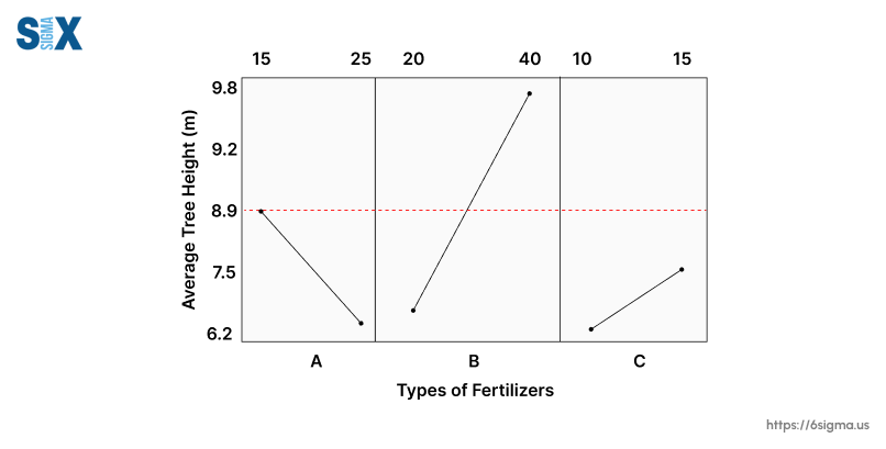
1. Horizontal line: If the line is horizontal (parallel to the x-axis), it indicates that there is no main effect present. In other words, the levels of that factor do not significantly affect the response variable.
2. Non-horizontal line: If the line is not horizontal, it signifies the presence of a main effect. The steeper the slope of the line, the greater the magnitude of the main effect.
3. Positive effect: If the line slopes upward from left to right, it indicates a positive main effect, meaning that increasing the factor level results in an increase in the response variable.
4. Negative effect: Conversely, if the line slopes downward from left to right, it represents a negative main effect, where increasing the factor level leads to a decrease in the response variable.
It’s important to note that while main effects plots provide valuable visual cues, determining the statistical significance of the observed patterns requires further analysis, typically through hypothesis testing or analysis of variance (ANOVA).
Understanding the Main Effects
Interpreting main effects plots is a crucial skill for any practitioner involved in process optimization and improvement initiatives.
While the graphical representation provides an intuitive overview, a deeper understanding of the underlying concepts is essential to make informed decisions and draw meaningful conclusions from the data.
Identifying Main Effects from the Plot
When analyzing a main effects plot, the first step is to identify the factors that exhibit significant main effects. This is typically done by examining the slope and direction of the lines representing each factor.
A steep slope indicates a strong main effect, while a horizontal line suggests no significant impact on the response variable.
It’s important to note that the magnitude of the main effect is not solely determined by the steepness of the slope; the scale of the y-axis also plays a role.
For instance, a relatively shallow slope may still represent a substantial main effect if the response variable is measured on a large scale.
Positive, Negative, and No Effects
Once the factors with significant main effects have been identified, the next step is to determine the nature of those effects – positive, negative, or negligible.
Positive effect: A positive main effect indicates that increasing the factor level leads to an increase in the response variable. On the plot, this is represented by an upward-sloping line.
Negative effect: A negative main effect, on the other hand, suggests that increasing the factor level results in a decrease in the response variable. This is depicted by a downward-sloping line on the plot.
No effect: If a factor exhibits a horizontal line on the main effects plot, it implies that changing the factor level does not significantly impact the response variable – in other words, there is no discernible main effect.
Understanding the nature of the main effects is crucial for making informed decisions about factor settings and optimizing the process or system under investigation.
Determining Statistical Significance of Main Effects Plot
While main effects plots provide valuable visual insights, it’s essential to complement the graphical analysis with statistical significance testing.
This is typically done through hypothesis testing or analysis of variance (ANOVA) techniques.
The p-value is a widely used statistical measure that quantifies the probability of observing the observed (or more extreme) data, assuming that the null hypothesis (no main effect) is true.
A small p-value (typically less than 0.05 or 0.01, depending on the chosen significance level) suggests strong evidence against the null hypothesis, indicating a statistically significant main effect.
ANOVA is a powerful statistical method that allows us to analyze the main effects and potential interactions between factors simultaneously.
It breaks down the total variability in the data into components associated with each factor and their interactions, enabling us to determine the statistical significance of each effect.
It’s crucial to note that while main effects plots provide an intuitive starting point for analysis, relying solely on visual interpretation can be misleading.
Statistical significance testing ensures that our conclusions are backed by sound statistical evidence and reduces the risk of drawing erroneous inferences from the data.
Analyzing Main Effects with Minitab
In the world of data analysis and process improvement, having the right tools can make a significant difference in our ability to extract meaningful insights from data.
Minitab, a renowned statistical software package, offers a comprehensive suite of features for creating and analyzing main effects plots, empowering practitioners to effectively leverage this powerful visualization technique.
Creating Main Effects Plot in Minitab
Minitab provides a user-friendly interface for generating main effects plots from experimental data. Users can easily create these plots by following these steps:
- Import or enter the data into Minitab.
- Navigate to the “Start” menu, then select “ANOVA” followed by “Main Effects Plot.”
- Specify the response variable (dependent variable) and the factors (independent variables) of interest.
- Customize the plot settings, such as the title, axis labels, and legend, as desired.
Minitab’s intuitive interface and robust capabilities make it a popular choice among practitioners in various industries, from manufacturing to healthcare and beyond.
Interpreting Minitab Main Effects Plot
Minitab offers two types of main effects plots: data means plots and fitted means plots.
Data means plots are generated directly from the raw data, while fitted means plots are based on the fitted model obtained from the analysis of variance (ANOVA) or regression analysis.
In both cases, Minitab’s main effects plots follow the same general interpretation guidelines as discussed earlier:
- Horizontal lines indicate no significant main effect.
- Non-horizontal lines represent the presence of a main effect, with steeper slopes indicating stronger effects.
- Upward-sloping lines indicate positive main effects, while downward-sloping lines suggest negative main effects.
Additionally, Minitab provides visual cues, such as reference lines representing the overall mean response, to aid in the interpretation of the plots.
Minitab Examples and Case Studies
To illustrate the practical application of main effects plots in Minitab, let’s consider a case study from the manufacturing industry.
Suppose a company is investigating the factors that influence the tensile strength of a particular metal alloy.
The main effects plot generated in Minitab might reveal that factors such as temperature and alloy composition have significant positive main effects while the cooling rate exhibits a negative main effect.
By analyzing the main effects plot, the company can prioritize its efforts on optimizing the temperature and alloy composition while also considering the impact of the cooling rate on the tensile strength.
This information can be used to refine the manufacturing process and improve product quality.
Minitab’s extensive documentation and online resources, including case studies and real-world examples, provide valuable guidance and insights for practitioners looking to enhance their understanding and application of main effects plots in various domains.
Main Effects Plots vs. Interaction Plots
While main effects plots are invaluable tools for identifying the individual impact of factors on a response variable, they do not account for potential interactions between these factors.
In many real-world scenarios, the effect of one factor may depend on the levels of other factors, a phenomenon known as factor interactions. To fully understand the behavior of a process or system, it is crucial to complement the analysis of main effects with an examination of interaction effects.
Difference Between Main Effect and Interactions
Main effects represent the individual impact of a factor on the response variable, averaged across the levels of other factors in the experiment.
Interaction effects, on the other hand, describe how the effect of one factor changes depending on the levels of another factor.
In simpler terms, main effects focus on the independent influence of each factor, while interactions capture the combined or joint effects of multiple factors working together.
Interpreting Interaction Plots
Interaction plots are graphical representations that depict the mean response values for all combinations of factor levels. These plots are particularly useful for detecting and interpreting interactions between factors.
The key patterns to look for in an interaction plot are:
- Parallel lines: Parallel lines indicate no interaction between the factors. The effect of one factor does not depend on the levels of the other factor(s).
- Non-parallel lines: Non-parallel lines suggest the presence of an interaction effect. The degree of non-parallelism reflects the strength of the interaction.
- Intersecting lines: Intersecting lines often represent a strong interaction effect, where the factor levels exhibiting the highest and lowest responses reverse depending on the levels of the other factor(s).
It’s important to note that interpreting interaction plots requires a careful examination of the patterns and may involve analyzing multiple plots simultaneously, especially in experiments with three or more factors.
Identifying Interactions Using Plots
While main effects plots can provide insights into individual factor effects, they do not reveal potential interactions between factors.
To detect and interpret interactions, practitioners must rely on interaction plots or conduct formal statistical tests, such as analysis of variance (ANOVA) or regression analysis.
In addition to interaction plots, Minitab and other statistical software packages offer tools for conducting interaction tests and quantifying the statistical significance of any observed interactions.
These tests help ensure that the conclusions drawn from the graphical analysis are statistically sound and not merely artifacts of random variations in the data.
By combining the analysis of main effects and interactions, practitioners can gain a comprehensive understanding of the factors influencing a process or system, enabling them to make more informed decisions and optimize performance effectively.
Advanced Techniques and Analysis
While main effects plots and interaction plots provide valuable insights into the behavior of processes and systems, there are situations where more advanced techniques are required to capture the nuances and complexities of the underlying relationships.
Nonlinear Main Effects and Center Points
In many real-world scenarios, the relationship between a factor and the response variable may not be linear.
In such cases, the traditional main effects plots, which assume a linear relationship, may fail to accurately capture the true nature of the main effects.
To address this issue, practitioners can incorporate center points into their experimental designs. Center points are additional experimental runs conducted at the midpoint of the factor levels.
By including center points, analysts can detect potential curvature or nonlinearity in the main effects and adjust their analysis accordingly.
Advanced statistical techniques, such as polynomial regression or response surface methodology, can then be employed to model and analyze these nonlinear main effects, providing a more accurate representation of the underlying relationships.
Main Effects in Regression Models
Regression analysis is a powerful statistical technique that allows practitioners to model the relationship between one or more independent variables (factors) and a dependent variable (response).
In the context of main effects analysis, regression models can provide a quantitative assessment of the main effects, as well as their statistical significance.
Linear regression models, for instance, can be used to estimate the main effects of factors on the response variable, while also accounting for potential interactions and other model terms.
These models can be extended to include higher-order terms, such as quadratic or cubic terms, to capture nonlinear main effects.
Regression analysis not only provides numerical estimates of the main effects but also enables practitioners to perform hypothesis testing, calculate confidence intervals, and assess the overall model fit, further enhancing the robustness and reliability of the main effects analysis.
Next Steps
We’ve covered main effects plots from different angles throughout. No matter the industry, from manufacturing to new product development or business refining, the ability to identify and measure individual factor impacts has proven extremely valuable.
A main effects plot is a straightforward yet effective visual representation that lets experts quickly gauge which factors matter most and in what ways.
But where main effects plots really flex their muscle is when coupled with solid statistical methods like ANOVA and regression modeling. Combining visual insights with rigorous testing guarantees conclusions stand up to facts, reducing incorrect assumptions.
Effective main effects analysis isn’t a standalone process – it’s a vital part of carefully designed experiment strategies.
Plots can guide factor and level choices in experiment planning. And during data collection and analysis, they light the way, pointing out interesting areas and possible factor interplays needing deeper dives.
By seamlessly blending analysis with the iterative experimental cycle, professionals continuously refine their understanding while honing in on optimum conditions or configurations.
As tech advances, main effects applications continue spreading. From materials science and nanotech to complex biology and environmental modeling, understanding intricate factor interplays remains key.
Blending traditional statistical methods with machine learning’s predictive strengths and pattern recognition could unlock fresh perspectives on thorny challenges.
Plus, huge data and sensor networks invite analysis into real-time process monitoring and smart optimization. Always analyzing parameters dynamically reshapes operations for higher performance sustainably.
Looking ahead, growth will come from relentless discovery, innovation, and perfection pursuits. Main effects tools, properly integrated into the investigation, engineer solutions previously out of reach.
SixSigma.us offers both Live Virtual classes as well as Online Self-Paced training. Most option includes access to the same great Master Black Belt instructors that teach our World Class in-person sessions. Sign-up today!
Virtual Classroom Training Programs Self-Paced Online Training Programs