How to Create a Pareto Chart for Root Cause Analysis
One of the most useful tools in Six Sigma is Root Cause Analysis (RCA). One of the most effective tools in your RCA Toolkit is the Pareto chart. In today’s practical guide, we look at what a Pareto chart can do for you, as well as how, and when, to create your own Pareto chart as part of RCA.
When Do You Use a Pareto chart?
While Pareto charts can be highly effective, they are only useful for certain types of data, namely, hypothetical data.
Below is a guide to knowing when a Pareto chart is necessary:
- If you are analyzing data about potential root cause problems in processes or the frequency of problems.
- You are dealing with many different problems and causes, but you want to focus on the most significant ones.
- If you are analyzing wide-reaching causes by zeroing in on their individual components.
- You want to easily convey information to others about your data.
Click Here to know more about our training solutions
How Do You Create a Pareto chart?
- Firstly, decide on the categories that will be used to group your data items.
- Then decide on appropriate measurements for your data. This will be frequency, quantity, cost, time, and so on.
- Next, decide on the length of time your Pareto chart aims to cover. Will it be a single work cycle? A full day, or week? You will need to decide the period early on. It could be longer still, a month or even a year.
- Now you need to gather the data, recording which category each item reflects as you go. If you already have the data, then you should simply put it in order, again assigning and arranging by category.
- Calculate the subtotal of each category’s measurements.
- Devise an appropriate scale for your measurements. There should be a maximum value of the largest subtotal (see step 5), marking the scale on the left side of your diagram.
- Draw the bars and add appropriate labels for reach category, placing the tallest on the far left, descending to the smallest on the far right. Any categories that involve small measurements should be labeled as “other”.
The following two steps are not always necessary, except for analytical and communication purposes. You can create a functional Pareto chart using steps 1 to 5, but you might find steps 8 and 9 provide additional levels of detail.
- Now you need to calculate each category’s percentage, that is, each category’s subtotal divided by the total for all of them. Then draw a right vertical axis labeled with these percentages, ensuring it matches the other scale, e.g. if your left-hand measurement equals one-half, the corresponding measurement should equal 50% on the right-hand scale.
- Finally, all that remains is to calculate and draw your cumulative sums. This can be done by adding the subtotals for your first and second categories, placing a cross over the second bar to illustrate that sum. Combine this figure with the subtotal for the third category, placing another cross above the third bar to illustrate the new sum. Continue to do this for the other categories, joining each cross with a line until they are all connected. The final cross should correspond to 100% on the right-hand scale. And there you have it, your very own Pareto chart!
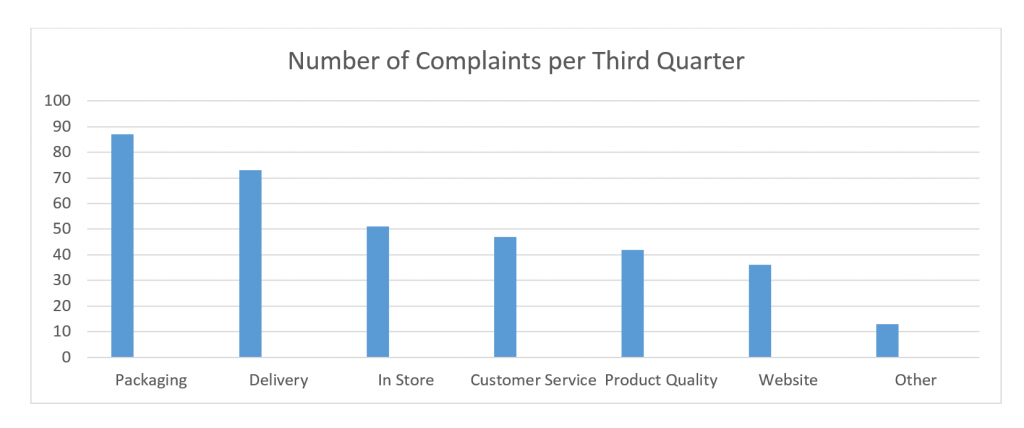
Pareto Chart Example 1
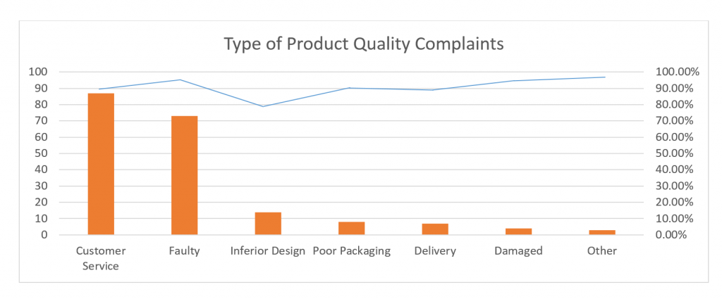
Pareto Chart Example 2
To learn more about our six sigma training solutions.
SixSigma.us offers both Live Virtual classes as well as Online Self-Paced training. Most option includes access to the same great Master Black Belt instructors that teach our World Class in-person sessions. Sign-up today!
Virtual Classroom Training Programs Self-Paced Online Training Programs